Who:
What:
Audience:
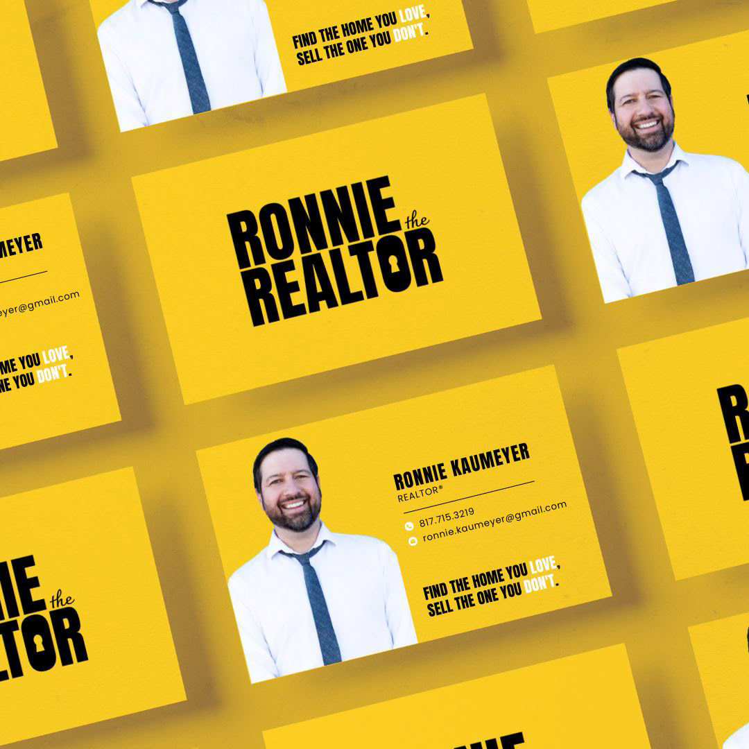
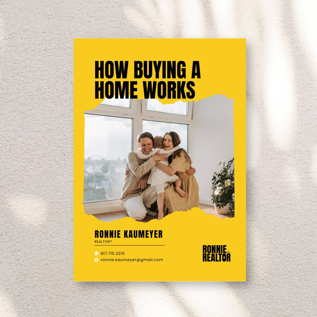
Ronnie the Realtor
Graphic Design | Brand Design
Adults (20+) looking for homes in the Dallas-Fort Worth area

Ronnie is a Texas Realtor serving the DFW area. New to real estate, but feeling lost in a saturated market, he wanted a logo that would help him stand out, something bold but polished.
I spent some time researching realtor logos and felt a bit stuck considering logos with houses and keys were typical and a bit overdone in real estate (and interior design, and construction, and mortgage companies...)
Going back to the basics, I spent time mind mapping and writing down the first things that came to my mind when I thought of home buying and real estate.
I felt like accentuating his name and his title would be a nice alliteration, and decided to keep it simple with a bold font and a delicate accent font for "the". Going over hundreds of logos, it felt like yellow might be a nice break from the mold. The juxtaposition between the yellow and the black makes the design pop even more.
Design programs used: Adobe Illustrator